The Art of Taste: Designing for food and drink brands
The Lane Agency • 10th Apr 2025
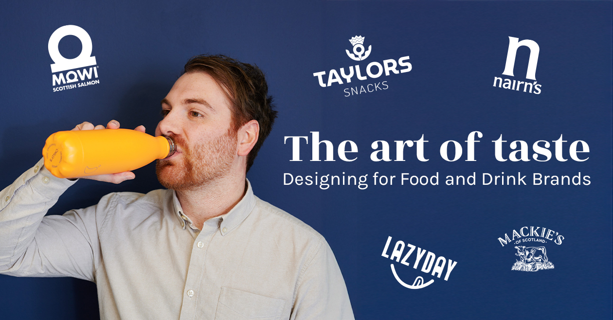
Graphic designer Mark Phillips shares his experience of working on some of Scotland’s most iconic food brands.
As a Graphic Designer, I’ve had the pleasure of working with some Scotland’s most well-known and well-loved food and drink brands, and each has brought its own unique challenges and creative rewards. From creating eye-catching packaging to designing campaigns that resonate with diverse audiences, my experience spans a wide range of products, each with its own story to tell. For an insider look into the unique nature of designing for food and drink, I’ll share insights from some of my stand-out brands over the years.
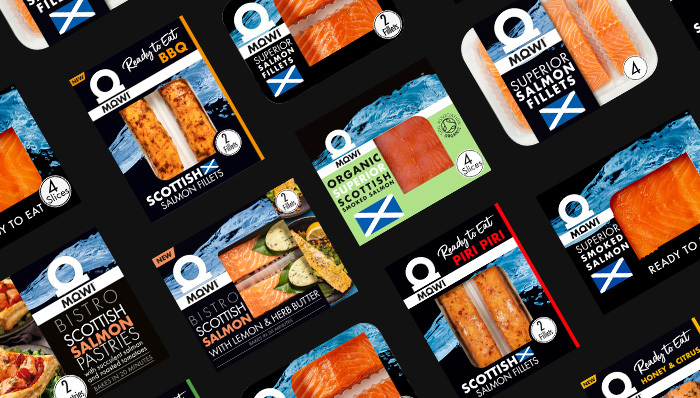
MOWI Salmon
Designing for MOWI Salmon’s social feed presented an exciting challenge. As a premium brand, MOWI prides itself on sustainability and high-quality Scottish Salmon. For this ongoing project, it’s essential that the designs convey the product’s freshness and ethical sourcing, as well as their position as a luxury food item against various alternatives on the supermarket shelves.
The approach here was clean, minimalist design, with a heavy emphasis on natural imagery – crisp photography of salmon fillets and slices, Scottish loch landscapes and fresh recipes help communicate the MOWI’s message of mastery and quality. Typography played a key role too, ensuring the brand felt both premium and accessible. A bold striking sans serif typeface delivers clear and legible messaging.
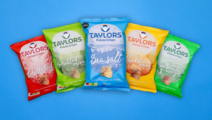
Taylors Crisps
Taylors Crisps are all about fun and flavour. As a snack brand, their visual identity needs to be vibrant, playful, and full of personality. My goal was to create designs that reflected the boldness of the flavours, while still maintaining an element of sophistication to appeal to a wider demographic.
What stood out most during the various Taylor’s projects, was the importance of visual storytelling. Using colour, pattern, and playful typography we were able to get across the bold flavours of the crisps and their unmistakable thick-cut crunch. This wasn’t just about standing out on the shelf; it was about creating an emotional connection with the consumer, making them feel like they’re choosing a snack that’s both exciting and crafted with care.
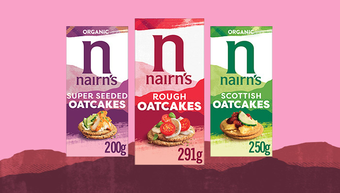
Nairn’s Oatcakes
Designing packaging and branding for Nairn’s Oatcakes requires a thoughtful approach that highlights the brand’s heritage, health-focused ingredients, and Scottish roots, while also ensuring a fresh, modern appeal.
Known for their commitment to simple, natural ingredients and a range of products catering for health-conscious consumers. This gives any designer lucky enough to work with them a unique opportunity to communicate these values visually. We began working on a new bold brand centred around merging colour and texture with a visual element of mountains as a subtle nod to their heritage and Scottish routes. This helped to create a striking new modern design that resonates with existing customers and helps to attract new ones interested in wholesome, authentic snacks. It helped highlight the simplicity of oats as a key ingredient while creating a design that reflected the brand’s health-conscious and natural ethos.
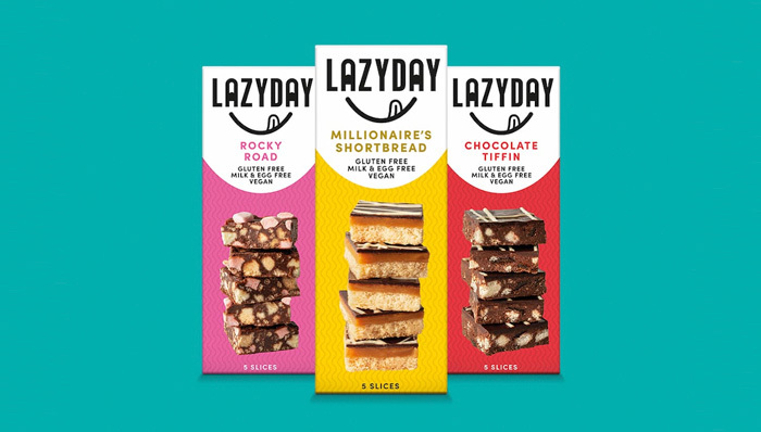
Lazy Day Foods
Lazy Day Foods’ focus on wholesome, natural products, translated directly into our design approach. By specialising in allergen-free treats, they required a specialised approach. Their designs needed to communicate that their products were both indulgent and free from allergens, a tricky balance to strike. The solution was to create a packaging design that felt inviting with comforting visuals and a touch of fun. This helped to make the packaging feel inclusive and indulgent without compromising on their health-conscious message. We achieved this by first designing a new brandmark that portrayed Lazy Day and a fun quirky treat; a smile licking lips over how deliciously tasty their snacks are. Sticking with this quirky mark we created packaging that mirrored their new brand and created a range of fun and engaging packaging designs for maximum standout effect on supermarket shelves.
The Takeaway
Working with a diverse portfolio of food and drink brands has taught me that no two projects are the same. Each brand comes with its own unique story, values, and target audience, and as a designer, it’s my job to translate that into a visual language that speaks to the consumer. Whether it’s the bold and punchy Taylors Crisps, the refined elegance of MOWI Salmon, or the tradition of Nairn’s Oatcakes, each project requires a tailored approach that brings the brand’s personality to life.
In the world of food and drink, the brand design is so important to a customer. It has to convey everything from the product’s quality and flavour to the ethos behind the brand itself. It’s a challenge, but one that I find endlessly exciting.
Designing for taste is about more than just aesthetics, it’s about creating experiences, sparking emotions, and, ultimately, making a connection. Whether it’s through playful colour schemes, elegant typography, or subtle, natural imagery, the goal is always to leave a lasting impression that resonates with the consumer long after they’ve left the store.