We’re now B Corp certified! Learn more
With a new ownership and vision, Silverburn set out to evolve its brand, elevating its presence and appeal beyond Glasgow.
Insight
Since 2007, Silverburn has been an all-day, all-ages destination serving Glasgow with a range of shops, restaurants and leisure facilities.
With new Spanish owners, Eurofund, and some exciting new brands on the horizon (Zara, H Beauty and Kingpins), Silverburn came to Lane to reshape their branding to better reflect their 2024 offering and entice more guests from beyond Glasgow.
We started with an in-depth brand workshop, including a range of Silverburn representatives from the internal Glasgow team and Eurofund in order to create a brand wheel that everyone was on board with. From this, we identified that they wanted to operate in a more premium space with an understated elevated offering that would differentiate the destination from its main competitors – Buchanan Galleries, St Enoch and Braehead – with a stronger brand presence.
The workshop also allowed us to identify elements of the current brand that were not fit-for-purpose such as their headline font which they felt was not universally legible.
Idea
The rebrand started with the name itself. Silverburn had to stay as it was recognisable, but we added in Glasgow which is widely known across Scotland as a renowned shopping destination.
The Ink Blue from their previous brand palette was another legacy, but we added a range of neutrals, Saffron for vibrancy and sophistication, and a Blush Pink for more light-hearted communications. The colour palette could also flex with some seasonal variations. New fonts were accessible and timeless, taking account for the fact that they’ll be used widely and on internal documentation.
A pattern was also created, allowing us to put the Silverburn stamp on everything, alongside black and white photography that used up-and-coming model talent. These could be used on hoarding and branding on blank spaces as the centre prepared to welcome new brands.
The visual updates were paired with a new tone of voice that was developed from all the learnings from our brand workshop. We introduced five tone of voice pillars that everyone could use to ensure that any copy was on brand – Inviting, Vibrant, Grounded, Confident and Aspirational.
Impact
The new brand has been warmly welcomed by Silverburn’s internal team and their Spanish owners as we were able to please the nuances of both parties. Branding has been rolled out across the location to a grand scale, through a new website and on assets from social to gift cards. Silverburn’s wider agency circle, including PR and social, are on board with the new position and we’re all set for a collaborative future as Silverburn states it’s claim as Scotland’s leading retail and leisure destination.
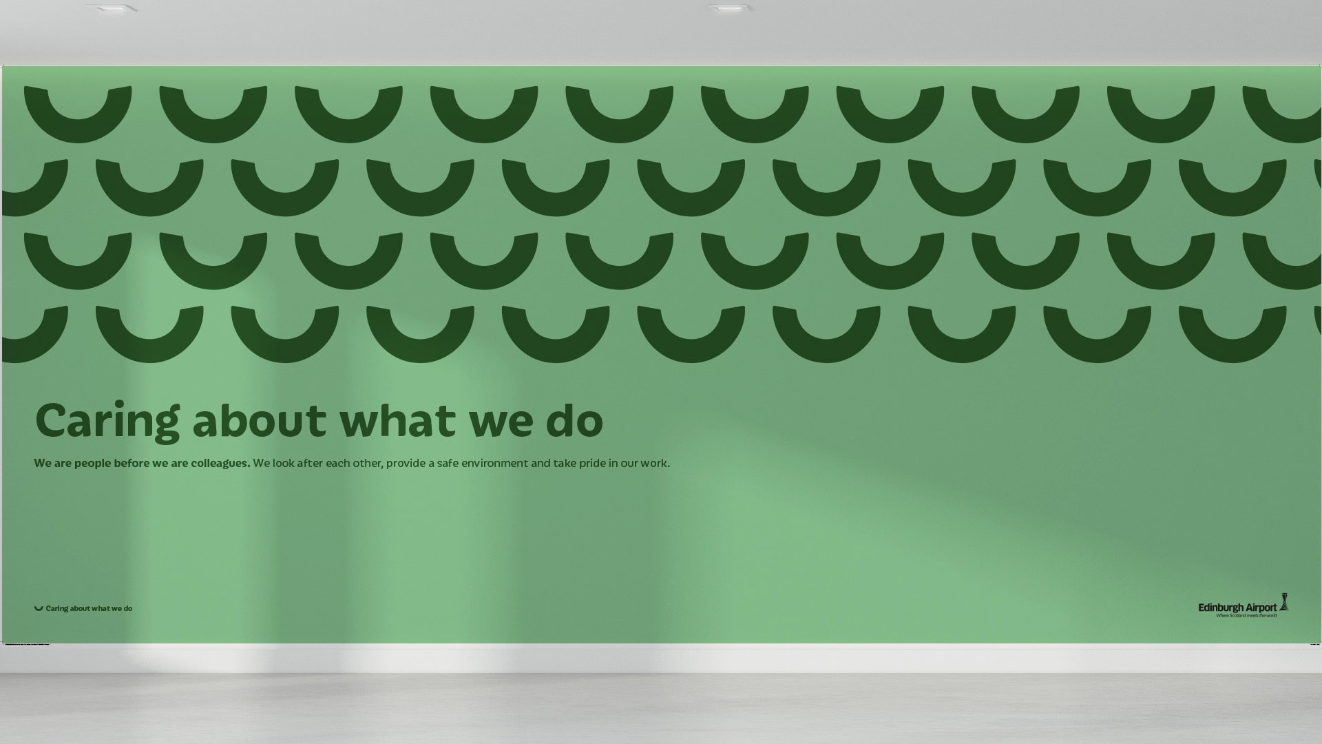
An iconic way to make employees feel more valued
View Case Study An iconic way to make employees feel more valued